Animated stacked bar charts with D3.js
A few months ago I was involved in a dashboard redesign for an accounting SaaS who, among other things, requested the development of an animated chart that was interactive and graphically in line with the rest of the UI.
The main charting libraries available out there don't offer, understandably given their approach, the level of customisation I needed, and this was the main reason I learnt towards using D3.js.
D3 differs from other libraries as it allows creation of data-driven documents, so possibilities were truly infinite; its website contains truly amazing examples.
I personally found it not to be a quick study, so because of this I decided to share what I have learned.
Data
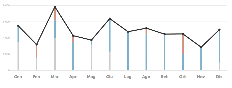
The chart's aim is to make readable the user's invoices for a given year. So what I really have is a service that, given a year, returns a JSON with month–by–month invoicing, made up of the total invoices awaiting payment, those that are paid, and those that are late in payment. In the example I've used 3 static JSON instead, one per selectable year.
Each JSON is composed of a 12 elements array, each structured as follows
{
    "hold":1234,
    "paid":2345,
    "overdue":0,
    "label":"Feb"
}
The chart has been designed to allow the user to see yearly trending and to provide quick access to month–by–month status.
Once the data and visualisations are defined we can move on to creating everything else.
Design
My advice is to first make a static SVG of the finished chart and import it into your HTML, defining styles via CSS as usual (I started with an Illustrator file provided by our graphic designer). This way we can exactly figure out the resulting XML to the level of tags, classes, etc. and we can finally move on to the code.
D3 offers little to nothing that's ready–made at a UI level, but as we shall see it more than makes up with a set of truly indispensable methods.
Size and margins
In cases of charts with fixed dimensions, such as this one, the first thing to do issave the size and margins of the chart into a variable that'll always be available within our code. This data will be later used by D3 to calculate scale, range and domains and thus correctly manipulate our data.
chartMargin = {left: 40, top: 25, bottom: 45, right: 0};
chartSize.height = 320 - chartMargin.top - chartMargin.bottom;
chartSize.width = 880 - chartMargin.left - chartMargin.right;
To start with I created a node that will contain the real actual chart, setting the position based on the dimensions that were just saved
chartD3 = d3.select("svg#chart")
    .append('g')
    .attr("transform", "translate(" + chartMargin.left + "," + chartMargin.top + ")");
Scales and Axis
The next thing to do is to set the scale with relative domains and range, and then build the x and y axis for our chart. Scales, as described in the docs, are functions that map from an input domain to an output range.
For the x axis I used ordinal scales, while for the y axis I used quantitative scales, linear scales to be exact. The former work under a discrete domain — in my case a set of integers from 1 to 12 — and the output is an integer value equivalent to the size of the x axis in pixels for each month, calculated on the basis of the width of the chart.
// Set the x scale
x = d3.scale
    .ordinal()
    .domain(d3.range(data.length))
    .rangeRoundBands([0, chartSize.width], 0);

// Define the x axis
xAxis = d3.svg
    .axis()
    .scale(x)
    .tickFormat(function (i) {
        return data[i].label;
    })
    .orient("bottom");
The linear scales work on a continuous domain instead, in this case from 0 to the maximum invoices per month. The output is a value between 0 and the height of the chart in pixels. The nice(n) function draws out the domain such that the ends are rounded: this way a domain, for example [0,1234] is transformed into[0,1300]. In other words it makes the domain look more elegant.
// Set y scale
y = d3.scale
    .linear()
    .domain([0, d3.max(data, function (d) {
        return d.overdue + d.hold + d.paid
    })])
    .range([chartSize.height, 0])
    .nice(5);

// Set y axis
yAxis = d3.svg
    .axis()
    .scale(y)
    .orient("left")
    .tickSize(-chartSize.width)
    .ticks(5);
In order to delve deeper into the concepts of scales and domains, outside the official documentation, I found the following article useful.
Selections and data binding
D3 offers, among other things, a whole set of APIs for manipulating DOM, provided with excellent documentation that you can find here.
Nothing better than jQuery you might say: true, except that it allows for data binding, therefore joining data to a selection. Personally, I have found this aspect less trivial to learn, but once grasped it opens infinite possibilities.
In my case one of the first things that was necessary to do was to create the vertical bars of my chart, so one per month. I wanted to insert everything inside a <g class="placeholder"> node, so I created this first and added it to my primary node.
//Create a placeholder for g.bar
let g = chartD3.append("g").attr("class", "placeholder");

//Join data with selection
let bars = g.selectAll("g.bar").data(data);

//Create elements if not exists
bars.enter().append("g")
    .attr("class", "bar")
    .attr("transform", function (d, i) {
        return "translate(" + (x(i) + 40) + "," + chartSize.height + ")";
    });
The selection is initially empty, as such I want to create all the DOM elements according to my data (if tomorrow months were to become 13 in number I need only to update the API without touching anything on the front end). When I link the data to the selection, D3 inserts the unmatched data inside the enter selection. By appending to the enter selection I can create new nodes <g> for any unmatched data.
HI used this method to dynamically create my SVG so that it would be identical to the static one I had initially created as a reference.
Update and animation
Once our SVG was created I added some simple animations to make it more appealing. D3 provides utilities to help with this task, very well documented and rich in examples.
So how should I behave when data is updated? All that's needed is to repeat the data binding to the selection that requires updating, for example
// Change the y axis
chartD3.select('y.axis').transition()
    .duration(600)
    .ease('quad-in-out')
    .call(yAxis);
In my case the length of the array returned by my API is always constant. If in your case the data were to be variable you can always use the enter selection view ahead of time so as to create new nodes.
In this case I advise you to also take a look at exit selection, which is useful for removing nodes that no longer have bound data.
Consideration and tips
- D3 can seem difficult at first, but I think that this alone makes it best for those who need to create complex charts from structured databases;
- In addition to the documentation take a close look at all the examples on the website, they are a truly infinite resource;
- Analysis, processing, and visualisation of data are very interesting aspects of development and seemingly highly requested by businesses.